|
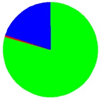
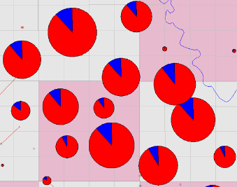
Pie style |
Bubble style |
|
|
|
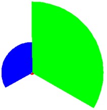
Use either bubble style to view a comparison of different elements in a feature. Which style you choose is a matter of preference. The following images show the difference between how the different bubble styles appear (with style set to Solid):
|
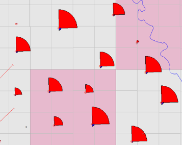
Pie style |
Bubble style |
|
|
|
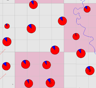
In this example, the parameter is Production Rates, and the bubbles show how much oil (green), gas (red), and water (blue) was produced at each well. These bubbles show more oil production than water or gas. With bubble maps, you can compare rates for individual wells, but also how each well compares to one another in its production volume.
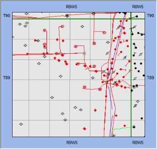
 Map View with Linear and Bubble
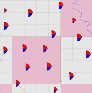
Map View with Bubble Map Turned Off
What do you want to do?