 View image

 How to open the Data Histogram dialog box
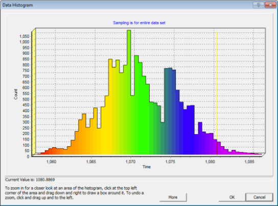
Use the Data Histogram dialog box to examine a graphical display of how colors are distributed over the value ranges of your posted map or seismic data. You can display histogram representations of time, amplitude, depth, velocity, time slices, horizon conformal slices, or attribute surfaces.
The horizontal axis shows the range of values for your data. If the color range is currently set to auto zoom, the vertical axis shows the number of data samples posted inside the current Map or Seismic window. Otherwise, the vertical axis shows the number of data samples across your entire data set. The top of the dialog box indicates which of these sources WinPICS
The color bars show the distribution of your posted data that corresponds to the range of values.
As you move your cursor over the histogram, a vertical line tracks the data value at that location on the axis. This value, displays to the fourth decimal point, appears beneath the histogram.
To zoom in for a closer look at an area of the histogram, click at the top left corner of the area and drag down and right to draw a box around it.
To undo a zoom, click and drag up and to the left.
The <More> button in the Data Histogram dialog box enables you to edit the ranges of your data. Use this function to find out what data values are above, below or within data ranges of the histogram.
Click <More> to display options for editing the current horizon pick using the data histogram.  View image
By default, your cursor is in zoom mode, as explained above. However, you can change the cursor mode to set minimum and maximum values, and clip the current horizon or grid. Follow these steps:
What do you want to do?