Open topic with navigation
Pie Property Tab
 View image
The Pie Property
tab, found on the Time Slice Property Page
dialog box, provides options for you to draw time slice pies that compare
more than one kind of parameter and see how their quantities change over
time (For example, you can compare cumulative production to cumulative
injection). Neither bubble mapping or time slice bubbles offer this option.
Time slice pies
offer you up to 20 different well parameters to compare (For example,
cumulative production gas and water production monthly average). Each
slice of the pie represents a different parameter.
- For best results, we
suggest selecting only five or six parameters; otherwise, your pie slices
become so small that comparing the parameters becomes difficult.
- You may already be used to seeing these parameters in your tickets, but
the information may not be the same. For example, the cumulative oil that
displays in the well ticket is for the entire life of the well, while
the cumulative oil in the time slice is up to the end of the time slice
period. Read
more about the difference between the parameters in tickets and the parameters
in time slices
Create a time slice pie
- Look at the <OK>
and <Apply> buttons at the
bottom of the tab. If they appear dimmed, it's because you selected the
Show Text Only check box on the
Text Property
tab, which means that you selected to only show text on the map, and time
slice pies aren't text. If you want to create time slice pies, you need
to go to that tab and clear the check box before you continue with the
rest of the steps.
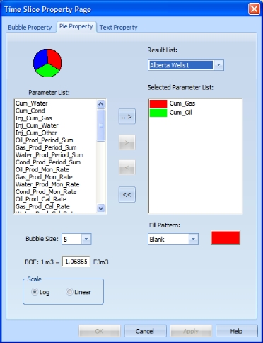
- In the Results
List list, select for which result list to draw time slice pies.
- The Parameter
List box displays all the well parameters in your map that are
available for comparison. Select a parameter that you want to display
in your pie, and click <>>
to move it to the Selected Parameter
List box. For example, if you are interested in seeing how much
oil, gas, and water each well in your area produced, select Cumulative
Productions.
- The more parameters you select, the smaller the slices of the pie become.
You can select up to a maximum of 20 parameters for a pie. If you select
more, or try to move all the parameters to the Selected
Parameters List window, GeoVista
will display a warning message.
- In the Bubble
Size list, select the relative size of the time slice pie, compared
to the scale of the map. Keep your bubble fairly small so that you do
not fill up your screen. The default size is 5.
Use the larger bubble sizes if you want to zoom in and look at a single
bubble.
- In the
box, adjust the value to account for differences in the relative amount
of energy contained in the substance. Read more
- In the Scale
box, select either a log or linear-style graph. How you set this option
just depends on your viewing preference. Read
more
- Click <OK>
to draw your time slice pies and close the dialog box, or click <Apply> to draw your time slice
pies but keep the dialog box open to continue to edit how the time pies
appear.
Change the fill pattern and color of a parameter
GeoVista automatically selects
the colors for each parameter, using the default colors for oil, gas,
and water, which are green, red, and blue, respectively. If you want to
change the colors, follow these steps:
- In the Selected
Parameter List box, click on the parameter whose color or pattern
you want to change. The Fill Pattern
list and the color box update to display that parameter's current settings.
- In the Fill Pattern
list, select a new pattern for the parameter. While the default pattern
for each parameter is solid, you can select a different fill pattern for
each of your parameters to make it easier to compare them in the map.
See your choices
- Click the color rectangle beside the Fill
Pattern list to open the Color
dialog box. Read more
- Select a new color and click <OK>.
- Try to set your time slice pies to
a color not already heavily used in the map. This will make smaller pies
easier to spot.
What do you want to do?