Open topic with navigation
Tie
with Diagnostics
 View image
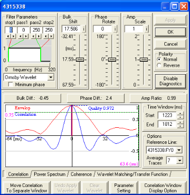
 How to open the tie with diagnostics dialog box
- Create a fence display of line segments to examine your line ties.
- Right-click on the seismic line that you want to adjust and select from the shortcut menu.
- If you open the Diagnostics dialog box from a single
seismic line (rather than a line in a fence display), you can apply all the tie seismic functions, but you can
only view the effect visually.
 About the tie with diagnostics dialog box
About this dialog box
Use the Diagnostics dialog box
to apply a variety of line tie functions from the same window. The tabs at the bottom of the window show your options for line tie diagnostics. Some of the features on the window change depending on which tab you select.
This help topic explains all of the line-tie features in the Tie with Diagnostics dialog box. For a step-by-step instructions on how to tie lines using the various diagnostics options, see the links at the bottom of this topic under the What do you want to do? heading.
Common Features
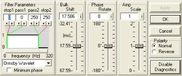
The features at the top of the window are common to all diagnostic options.
 About band-pass filtering
Band-pass filtering
The band-pass filter is defined by four corner frequencies. You have the following options for setting these values:
- Type values into the text boxes directly under Stop 1, Pass 1, Pass 2, and Stop2. Click <Apply> to view the filter effects on the power spectrum in the Power
Spectrum box at the bottom of the window.
- Click the arrows under Stop 1, Pass 1, Pass 2, and Stop 2. Click <Apply> to view the filter effects on the power spectrum in the Power
Spectrum box at the bottom of the window.
- Move the cue lines. As you pass your cursor over the filter display area, the cue line nearest your cursor is highlighted. Left click a cue line and, without releasing the mouse button, drag the cue line to a new location. Watch the values in the parameter boxes change. Release the mouse button to drop the cue line. WinPICS automatically applies the filter effects to the power spectrum in the Power
Spectrum box at the bottom of the window.
 About bulk shift
Bulk shift
You have the following options for applying bulk shifts:
- Left click on the slider bar button and, without releasing the mouse button, slide the button up or down to adjust the bulk shift. Changes are updated dynamically on the seismic section. Click on the
 button to change the increment (and thereby the sensitivity) of the slider. The increment can be set to milliseconds or microseconds.
- Type a value in the text box and click <Apply> to display the adjusted data.
- Left click on the slide bar (above or below the button) to shift your data in increments of 10 ms (default). The default can be changed by clicking on the
 button and typing a new increment value.
When you display a line that has a bulk shift, the magnitude of the shift is displayed on the status bar at bottom of the Seismic window.
 About phase rotation
Phase rotation
You have the following options for applying bulk shifts:
- Left click on the slider bar button and, without releasing the mouse button, slide the button up or down to adjust the phase. The seismic section updates dynamically. Click on the
 button to change the increment (and thereby the sensitivity) of the slider. The default increment is 15 degrees.
- Type a value in the text box and click <Apply> to display the corrected data.
- Left click on the slide bar above or below the button to phase rotate your data in increments of 15 degrees (default). Changes are updated dynamically on the seismic section. The default can be changed by clicking on the
 button and specifying a new increment value.
 About amplitude scaling
Amplitude scaling
You have the following options for scaling the amplitude:
- Left click on the slider bar button and, without releasing the mouse button, slide the button up or down to adjust the amplitude scaling. Changes are updated dynamically on the seismic section. Click on the
 button to change the increment (and thereby the sensitivity) of the slider. The default increment is 0.02.
- Type a value in the text box and click <Apply> to display the adjusted data.
- You can also left click on the slide bar (above or below the button) to shift your data in increments of 0.1 (default). Change the default by clicking on the
 button and specifying a new increment value.
When you display a line which has an amplitude scale factor applied, the magnitude of the scale factor is displayed on the status bar in the Map window.
 Apply vs. OK
Apply
Click <Apply> to update the seismic display with any new values you typed into text boxes.
- Your original data remains unchanged.
OK
Click <OK> to apply all changes you made in the Diagnostics dialog box. A dialog box opens to show your tie options and output format.
 About polarity reversal
Polarity reversal
Select Normal for normal polarity or Reverse for reverse polarity. WinPICS automatically updates the seismic display. An R will appear on the status bar of your seismic window when the seismic data displayed is in reverse polarity.
 About enabling diagnostics
Enable diagnostics
When you first open the Diagnostics dialog box, this button will read Enable Diagnostics. Click <Enable Diagnostics> to expand the window and enable you to use the diagnostic line tie functions.Click <Disable Diagnostics> to turn off the diagnostics features. The lower half of the window will disappear.
Cross-correlation analysis
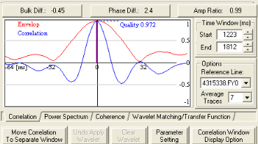
Click on the Correlation tab to see the options available for cross-correlation analysis.
 About the correction buttons
Correction buttons
Use these buttons to apply bulk shift, phase, and amplitude corrections to the seismic data. These estimates are based on the cross-correlation function. To apply these corrections, click on one of the following buttons:
- <Bulk Diff> - Estimate the time shift between the active and reference seismic lines. Bulk difference is estimated using the time shift of the cross-correlation peak from zero lag. A value of zero indicates no time shift.
- <Phase Diff> - Estimate the phase difference between the active and reference seismic lines. Phase difference is estimated by measuring the time difference between the peaks of the cross-correlation and envelope curves. The difference is converted to a phase shift based upon an estimate of the dominant frequency of the cross-correlation. A value of zero indicates no phase difference.
- <Amp Ratio> - Estimate the percentage difference in peak amplitude of the active and reference seismic lines. Amplitude ratio is estimated using a ratio of the RMS energy of the active data and the RMS energy of the reference data. A value of one indicates that the peak amplitudes are equal.
WinPICS
automatically updates the seismic, recalculates the cross-correlation function, and posts new values on the seismic.
 About the cross-correlation display
Cross-correlation display
The blue curve represents the normalised cross-correlation function of the active seismic line with the reference seismic line in the time domain. The red curve is the envelope amplitude of the cross-correlation function. If two seismic lines are perfectly tied:
The cross-correlation plot is symmetrical about zero time, and the largest peak in the envelope is positive and centered about zero time.
Quality is a measure of the similarity between the active and reference seismic lines. The value is posted on the cross-correlation plot. A match between two identical traces results in a maximum value of ‘1’. This maximum value can be used as measurement of quality. Values less than ‘0.5’ indicate significant problems in matching the data. Check your diagnostics parameters to see if the cross-correlation function has valid parameters to work with.
Spectral analysis
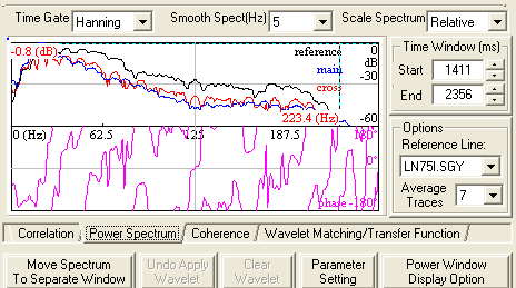
Click on the Power Spectrum tab to see the options available for spectral analysis.
 About the spectral analysis display
Spectral analysis display
The upper curve is a logarithmic scale of the power spectrum of the
active
seismic line (blue),
the reference
seismic line (black), and the
cross-correlation of the two seismic lines (red). Use these curves to determine the
useful bandwidth of the data.
The lower curve is the phase spectrum of the cross-correlation (pink) function. A perfectly zero-phase
dataset would be displayed as a flat line at zero degrees over the meaningful
portion of the phase spectrum, as shown in this graphic. Outside the useful
bandwidth of the two datasets, the curve is meaningless.
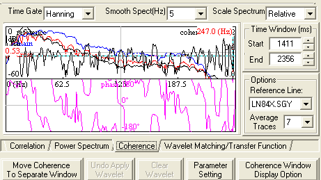
Coherence
Click on the Coherence tab to see the options available for coherence.
Wavelet matching and transfer function
Click on the Wavelet Matching tab to see the options available for wavelet matching and transfer function.
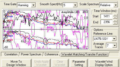
 About the wavelet matching display
Wavelet matching display
The black curve in the upper
plot is the ratio of the amplitude spectra. Zero values indicate similarity
of the amplitude spectra. The power spectrum of the active seismic line
is also shown in the background. The pink curve is the phase spectrum. Together,
the amplitude and phase spectra define the operator that when applied
to the active
seismic, would match it with the reference
seismic.
As you make adjustments, the power spectrum is recalculated and the
seismic is automatically updated.
What do you want to do?
 View image
 How to open the tie with diagnostics dialog box
 About the tie with diagnostics dialog box


 About the cross-correlation display

 About the spectral analysis display


 About the wavelet matching display